Beauty, of course, is in the eye of the beholder. That applies in spades to art. But it’s my blog, so what I say goes! Paris is filled with museums and some of the most famous works of art in the world. It’s not all in the Louvre. The Holy Grail of our art quest on this trip was the Musee d’Orsay, home of the Impressionists and Post-Impressionists: Manet, Degas, Monet, Van Gogh, Gauguin, Seurat, etc. etc. So, it was high on our to-do list when we first arrived. But when we were at Notre Dame, we struck up a conversation with another couple while waiting for the tour. They told us that the D’Orsay’s collection of Impressionists, etc., was closed as they were just finishing a two-year remodel of the galleries and the art was being moved. It was scheduled to reopen on October 20th. That was OK by us, as we had the whole month to play with. Little did we know . . .
Putting off the D’Orsay, we made for the Pompidou Center, the “Ugly” of our title. The Centre National d’Art et de Culture Georges Pompidou is the narcissistic monument to the late president’s ego. Reviled when it opened in 1977, it supposedly is now beloved by Parisians. It’s the “inside-out” building, where the structural components are exposed. Sorry. It’s interesting. But it’s still U-G-L-Y, and jarringly out of place in this city.
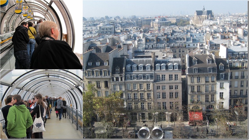
I kept thinking of Terry Gilliam’s “Brazil” movie when eyeing this monstrosity. Those Plexiglas tubes house the escalators that you take up to the various levels. I assume the air scoops are functional, but I dunno. Of course, old Georges’ puss is plastered two stories high across the front. Yeah, that is indeed the front that Loni is standing before. It was really cold this day, so we were glad to get inside (after standing in that line back in the distance).
We went up the tube escalators, stood in lines in the tube walkways, and gazed down on the poor houses across the way that now have to look at the Pompidou for all eternity. I’d pull the blinds.
The big show at the Centre currently is an exhibition of Edvard Munch (1863-1944), he of “The Scream” fame (which wasn’t part of the show). Munch is a good pick for the weirdness of the Pompidou setting. He was one strange character himself. He clearly had a lot of artistic talent, as shown in the “Night Wanderer” (1923-24):
But the themes he chose to paint about, and his depiction of his subjects as tortured souls, was bizarre. He was obsessed with death and conflict. The six below are representative. From the top left, then clockwise: “The Sick Child,” “Murder on the Road,” “Burning House,” “The Fight,” “The Uninvited Guests” (note the gun), and “Jealousy.”
I don’t think I’d like to spend much time in his company. His photo reminded me of Benito Mussolini, and he had a rather severe vision of himself in a few self-portraits.
We saw some other exhibits at the Centre, but weren’t allowed to photograph them. In one case, that was a blessing. As only the French can do (think of their veneration for Jerry Lewis), they were celebrating the winner of the Marcel Duchamp Prize (whatever that is), a no-talent photographer named Cyprien Gaillard. We didn’t get it. He took extremely ordinary (think a Kodak Brownie manned by a junior high school student) photos of mundane scenes and objects. They were all taken with the camera turned slightly, so that the image appeared in a diamond shape instead of a square. This is from the internet:
Big deal. I guess that diamond look was the “art,” cause it certainly wasn’t the compositions. Really, this was junk, and part of the “bad” of this post.
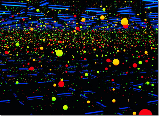
The other exhibit actually was pretty neat, and I wish we could have taken some pics. Google Yayoi Kusama images and see some of her works and installations. There were some mind-blowing rooms filled with lights, mirrors, or repeating patterns. Sort of a high-class fun house. [Note: I just noticed that you have to hold down the CTRL key when clicking on the link; that’s something new with Blogger.]
When the 20th rolled around, we were ready to beetle off to the D’Orsay. Not. We forgot to factor in the French predilection for strikes. Seems the gallery workers decided that, with the addition of new exhibit space, they needed at least 20 more employees to, ahem, properly serve the public and protect the art. So, they struck the morning of the reopening, which didn’t take place. No D’Orsay for us or anyone else. This went on day after day without any end in sight. I’m sure there were thousands of really pissed off tourists who didn’t have the luxury of staying longer. Hey, we only had a week left ourselves!
A companion museum to the D’Orsay is the L’Orangerie, which has a nice collection of stuff we liked, such as:
Picasso was well represented in the regular collection, and it was interesting to see his transition from realism to abstract.
Frankly, I really like Picasso’s early stuff, and can’t stand his later nonsense.
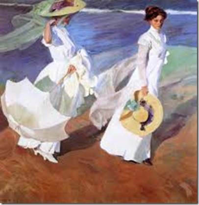
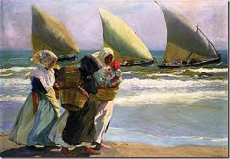
The special exhibition was of Spanish artists of the post-impressionist era from about 1890 to 1920, subtitled “From Zuloaga to Picasso.” Frankly, I know virtually nothing about Spanish artists, so I was curious. Turns out it was some of the best art we saw the whole trip (my subjective opinion, of course). I haven’t the experience or knowledge to provide any analysis, all I can offer is what I liked. This exhibition was off-limits for photography, so I wasn’t able to get shots of the stuff I fancied. I really enjoyed Joaquin Bastida ‘s work, so internet to the rescue:
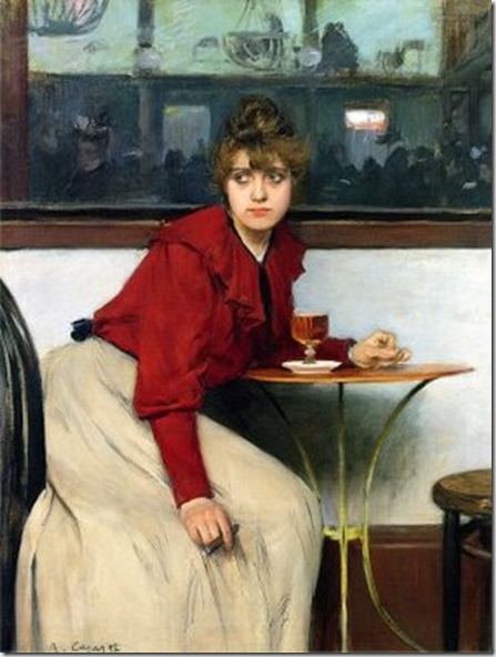
Ramon Casas was another favorite. Many of these Spanish artists came to Paris to soak in the French artists of the period, and their works sometimes are quite similar to more familiar painters, at least in their subjects if not in their styles, like this one, called “Madeleine.” The look in her eyes is amazing.
Perhaps another genre of my personal art criticism is the “hoax.” This is the “you gotta be kidding me” category. Topping the list at L’Orangerie was Monet’s “Water Lilies.” Two, huge, oval rooms are devoted to this farce. Here’s the official blurb:
Monet’s veritable artistic testament, these “large decorations” are the culmination of an entire life. Designed from 1914 until his death (1926), they are inspired by the “water garden” at the artist’s property in Giverny. The eight panels represented in these two rooms evoke the hours passing from morning in the East to sunset in the West. Monet represents neither the horizon, nor the top or the bottom. The elements – water, air, sky, earth – become intertwined in a composition without perspective, where the water lily flowers provide the rhythm. The painter thus gives “the illusion of an endless whole, of a horizonless and shoreless wave.”
Okayyy. Now here’s my take: Monet’s artistic downfall, these paint-by-the-numbers murals are the nadir of an entire life. The eight panels evoke somnambulism from dawn until dusk. There’s no beginning or end; in fact, like Oakland, there’s no there, there. The elements – monotonous colors, suffocating boredom, numbing repetition, utter lifelessness – become a composition without meaning or interest, where the lily flowers go on ad nauseam. the painter thus gives the reality of an endless murkiness.
Really. That this is considered some masterwork is the ultimate in hype. It looks like my Aunt Evelyn’s wallpaper. Here are parts of two of the eight (!) panels that cover two rooms.
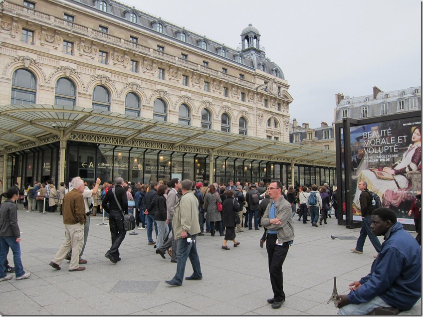
After eight days of striking, the D’Orsay workers finally got sufficient assurances that their demands would be addressed, and returned to their jobs. Finally, with only a few days to go in our trip, we got to see its works. It’s housed in a former train station. The French love to recycle buildings, and I’m all for it.
With a couple of rare exceptions, there is virtually no place in the museum that you are allowed to take pictures, so you are spared more shots of stuff that I like. I must say that the remodeled galleries are as good as all the hyperbole that accompanied the reopening. No more white walls, they’re all painted in darker hues. The lighting is incredible. Somehow, only the painting on display receives light, not the surrounding area. As a result, those masterpieces seem absolutely to glow and radiate their own light. It’s really stunning to see. We both had the “wow” reaction when we walked into the first impressionist room. Museum curators the world over should take a junket and come see what the D’Orsay has done, it’s that good.
About all we could photograph was where we had lunch. The D’Orsay occupies a huge building that used to be a train station, thus it is gigantic in its interior space, and has a number of oversized features. One of these was the station clock, which dominates the space where the lunch café was located.
If you look closely in the lower center of the right photo, you can see Sacre Coeur in the distance atop Montmartre. I have to say, the food was pretty good in the café, not at all like most museum fare.
To return to the Pompidou, there was another area in which I could photograph, but I didn’t much want to. There’s art, and then there’s junk that someone declaims is art. The mystery to me is why anyone believes it. It’s just bad.
So, with a tip of the hat to Sergio Leone, there you have it: the good, the bad, and the ugly.








1 comment:
I wish you would stop equivocating in your art criticism. This kind of milque-toast commentary is pointless. Tell us what you REALLY think!
Moving on, you should see the murals Munck did for the University of Oslo in the building which is now the city concert hall. They are incredibly bright and dramatic - a Norwegian sunrise on all four walls. I guess he starting drinking absinthe after that .......
Chuck B
Post a Comment